Decaf Sucks Launch Countdown: Development Complete!
After another two weeks of hard work, the Decaf Sucks iPhone app is finished and submitted to the App Store!
It’s been a whirlwind two weeks building this app alongside our usual Icelab work. Building this app has consumed me from 6pm - 1am every weekday, and all through 3 full weekends. While it’s certainly not a great example of a sustainable development effort, I think it has brought us some great results. Let’s have a look at some of the things that came up as we finished building the app.
Building an Interface
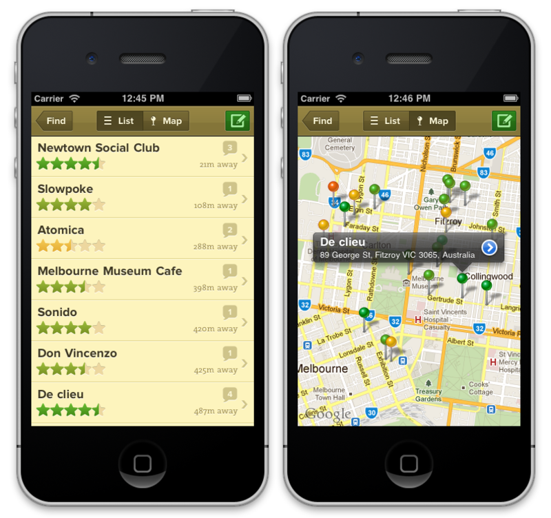
In my last post, I wrote about reducing our app’s user interface “surface area” so that we could increase the amount of attention and polish on that which remained. This turned out to be the best decision we could have made throughout this entire dev process. As I quickly learnt, building custom iOS interfaces is hard work.

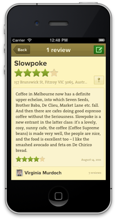
When it came to designing our app’s interface, we already had a long-established look and feel to draw from - the UI behind Decaf Sucks’ existing web and mobile web apps. We launched these nearly two years ago now, and have been refining them since. It was important that our app felt part of the same product. So when Max opened Photoshop and asked me how far he could go in customising the iPhone app’s UI, I said something along the lines of: “Well, we only have a navbar left, so let’s just give it a custom image background.”
Those were nearly my famous last words. A custom navigation bar background leads to custom buttons, and custom buttons in the nav bar lead to custom controls everywhere else in the app. And custom controls only look right alongside customised view background, images and fonts. To make a cohesive, friendly app, it’s an all-or-nothing proposition. And since Decaf Sucks has always been about good coffee stories wrapped in a beautiful interface, we took the “all” approach, and I have since developed the deepest respect and appreciation for the kind of people building fully-customised iOS interfaces (Those Tapbots guys? Gods!).
Despite it being laborious work at times, UIKit actually makes it pretty easy for you to build your own custom appearances for its controls. Referring to the great tutorials on iDev Recipes were invaluable for me to get started with this, and I soon became very fluent with handling stretchable images, methods like setBackgroundImage:forState, UIEdgeInsets, and pixel-precise frame manipulation, and making my own UIView or UIControl subclasses (plus some tricks behind making several totally unconnected UIViews look and behave like they are part of a single control on-screen).
Fun fact: we have 178 custom images making up the Decaf Sucks user interface. 62 of them are just of stars!
Despite how straightforward it is to customise your interface in most cases, Apple still likes to throw a few curveballs your way. One example is UISearchBar. There’s no way you can change how it looks without reaching into the subviews that make up this composite control. This approach is undocumented and unsupported, which means it could likely break in future iOS releases and perhaps even cause issues during our App Store approval process. Instead, we took the approach of manually creating our own set of controls (with our own custom appearance) that together behave in the same way as a regular UISearchBar. A bit of extra effort, but worth it for a cohesive interface.
Beauty Requires Reliability
Any iPhone user will quickly abandon a beautiful app that behaves unreliably. For Decaf Sucks, the most critical aspect of its operation is the management of the network calls that it makes to retrieve café and review information from our API.
In a testing session that involved madly and haphazardly clicking around the app, it became apparent that our network requests needed to be cancellable. If you’ve searched for cafés nearby, but quickly hit “back” because you’ve decided to search for a different area, then you don’t want the original API request for nearby cafes to keep running in the background.
The answer to this is to wrap your network requests in NSOperations and run them through a NSOperationQueue, which keeps the operations around while they are running, so you can get them back and cancel them if you need. Fortunately, the team behind the Gowalla app have just recently released the AFNetworking library, which is built entirely around NSOperations, and seems perfectly suited to API-oriented apps like ours.
Switching to AFNetworking was a straightfoward process, and it works entirely as advertised. All of our network operations are now cancelled when necessary, leading to a more robust experience for the user.
AFNetworking also has a couple of very handy helper categories, like on for UIImage that provides a setImageWithURL:placeholderImage:imageSize:options method, which fetches an image from a URL, resizes it, caches it and displays it, all with just a single line of code!
The final aspect of reliable networking is the API that is providing the information that the iPhone app requests. To ensure that our API can keep up with any new influx of users from the App Store, we’ve just moved decafsucks.com to Heroku. We’re now a single heroku scale command away from pumping up the resources behind the app. We’ve also put NewRelic monitoring in place so we can have good visiblity into the performance profile of the app. We’re ready to go!

Field Testing
Despite the tight timeframes around our app release, we wanted a field trial in which valued Decaf Sucks users and friends could try the app share their feedback with us. We managed to get a reasonably complete build released at midnight on a Friday, with a followup build out on Sunday morning. Even across a single weekend, we received some really great feedback.
One example was around finding a user’s location via the iPhones location services. We had a few cases where the app never ended up getting a user’s location. This was invaluable to learn, especially since it had never happened to me or anyone else from Icelab.
In addressing this issue, we’ve come up with a vastly better method for handling locations. Before, we simply asked the device to find our location with an accuracy of 100m, and waited until it could achieve that accuracy. That’s clearly no good in some environments, where achieving that accuracy could either never happen, or take a very long time. Now, we still ask for the location with a 100m accuracy, but we record each location update as it comes in, and save the most accurate result each time. After 5 seconds, if we haven’t got our desired accuracy yet, we just use the most accurate location result found so far, and show the user their cafés. This approach ensures that no one is kept waiting. Thank you to our testers for your feedback!
The whole field testing process was made ridiculously easy by using TestFlight, a web service that provides not just over-the-air delivery of app builds, but also handles the process of collecting feedback and even session information, logging and crash reports (using the TestFlight SDK) from your testers. You should be using TestFlight, it’s so good!
Distributed Work
As a side project, most of our work on the Decaf Sucks app was done from the comfort of our own homes, in the evenings and weekends. Apart from one brief whiteboard session with Max, all of our communication around the design and implementation work has taken place in the Icelab Campfire.
This worked very well, even with the tiny iterations that take place when implementing a screen’s design: Max would put the chopped up images into Dropbox, and I would see the files a second later and start integrating them into the app. Once there was something to show, I’d drop a screenshot into Campfire, Max would comment, I would make any necessary changes, then rinse and repeat. With the fast Xcode compile times, and the ease of dropping an image into Campfire, this was a very effective work cycle.
During the times when we weren’t both present, Campfire was an easy place to leave a couple of questions and have them answered when the other person came back online. All in all, it’s been a great way to work.
What’s Next?
We submitted Decaf Sucks to the App Store last night (Quick note: if you’re on OS X Lion and the Xcode app upload isn’t working, you probably need to re-install Java 6.), and our entry is sitting in iTunes Connect with a “Waiting For Review” label. So, all we can do now is wait!
Fingers crossed everything goes smoothly and our app can be out by Swipe Conference as promised. I’m happy to be going to Melbourne representing Icelab as fully-fledged iOS developers. I can say now that having now fully developed an iOS app, all of the sessions at the conference suddenly feel a lot more relevant and useful. I can’t wait to learn more!
Next week I’ll write more about our thinking behind some of the app’s features. In the meantime, you’ll hear from us as soon as the app is out, I promise :)
